WORK
HAPITYPE
Teaching
CV
About
Work with Me!
Tiffany Prater
Designer + Educator exploring how research and experimentation shape impactful visual systems.
WORK
HAPITYPE
Teaching
CV
About
Work with Me!
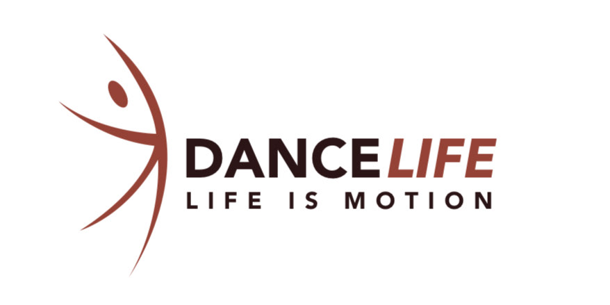
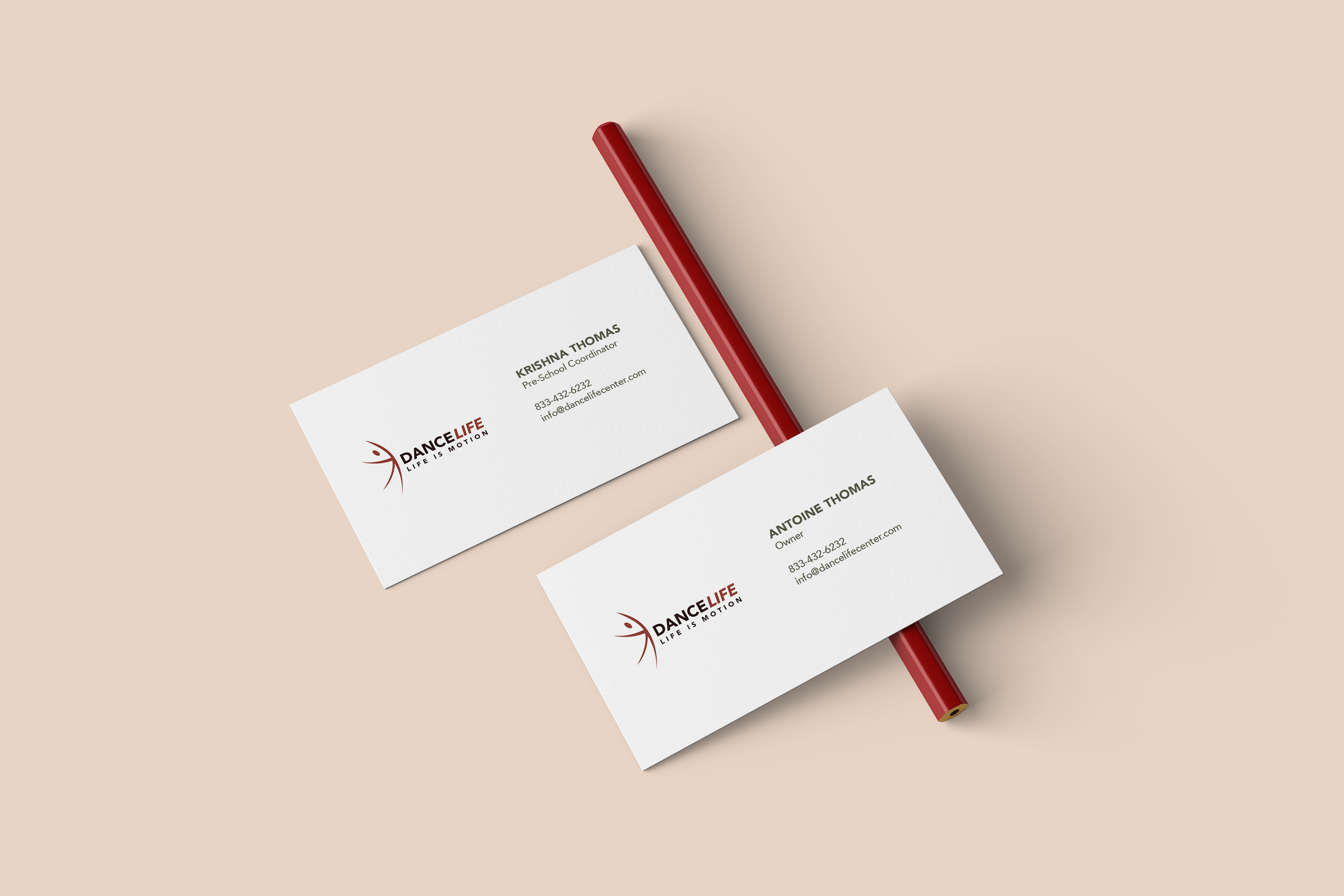
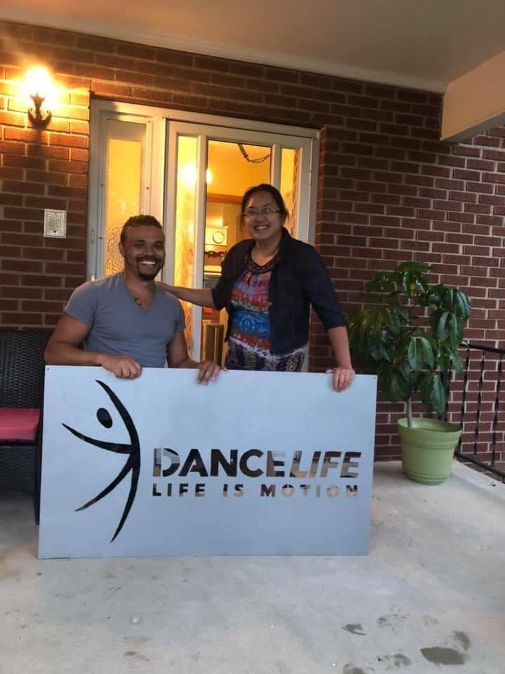
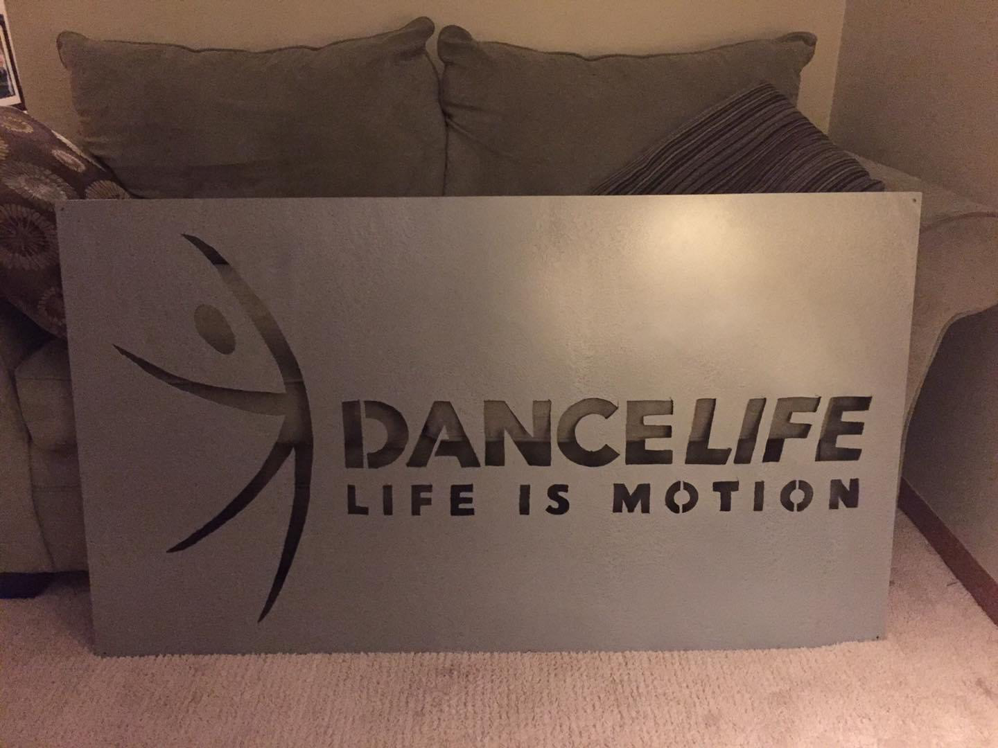
DanceLife center
Client: DanceLife Center | Creative Direction: Tiffany Prater
You may also like
2018
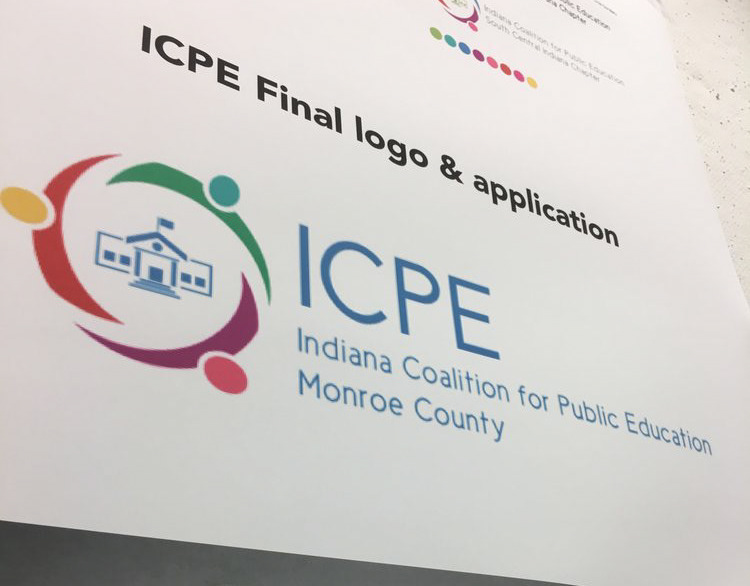
ICPE
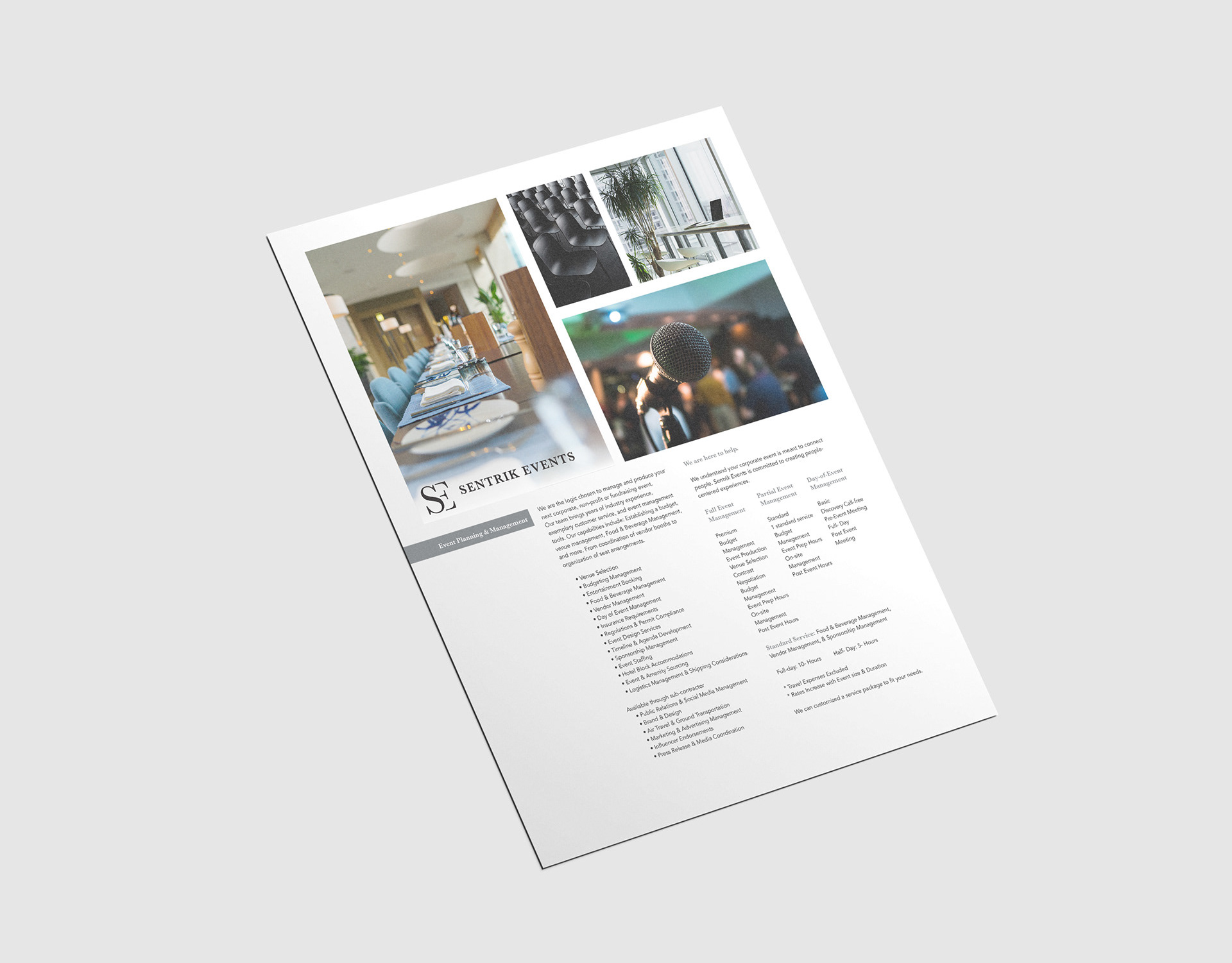
2021
Sentrik Events
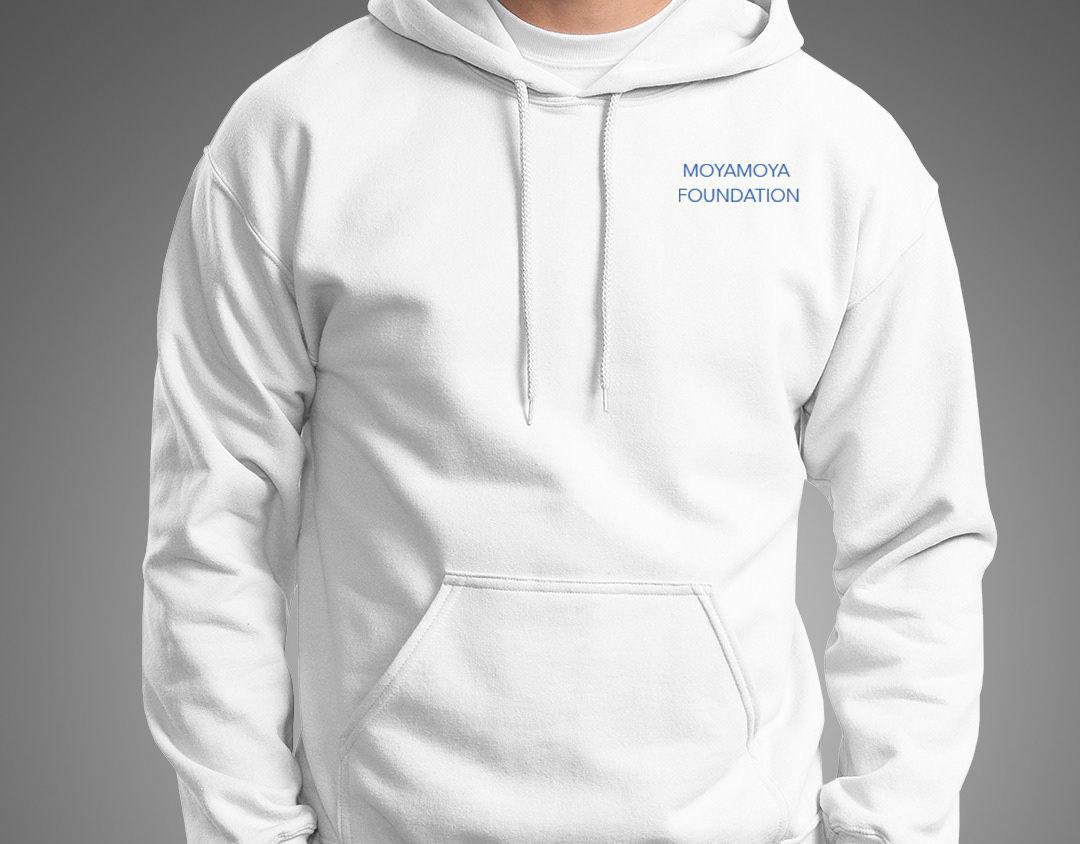
2019
The Moya Moya Foundation
2018
The Wizard of Oz
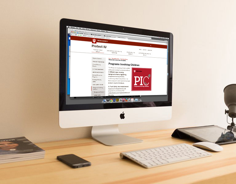
2016
Public Safety & Institutional Assurance
2018
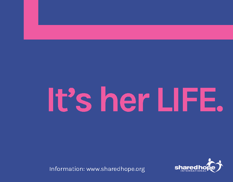
Hope - Sex Trafficking posters
2018
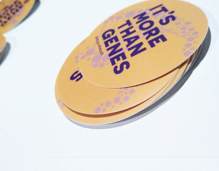
Case study - twin studies
2018
Protect IU posters
2021
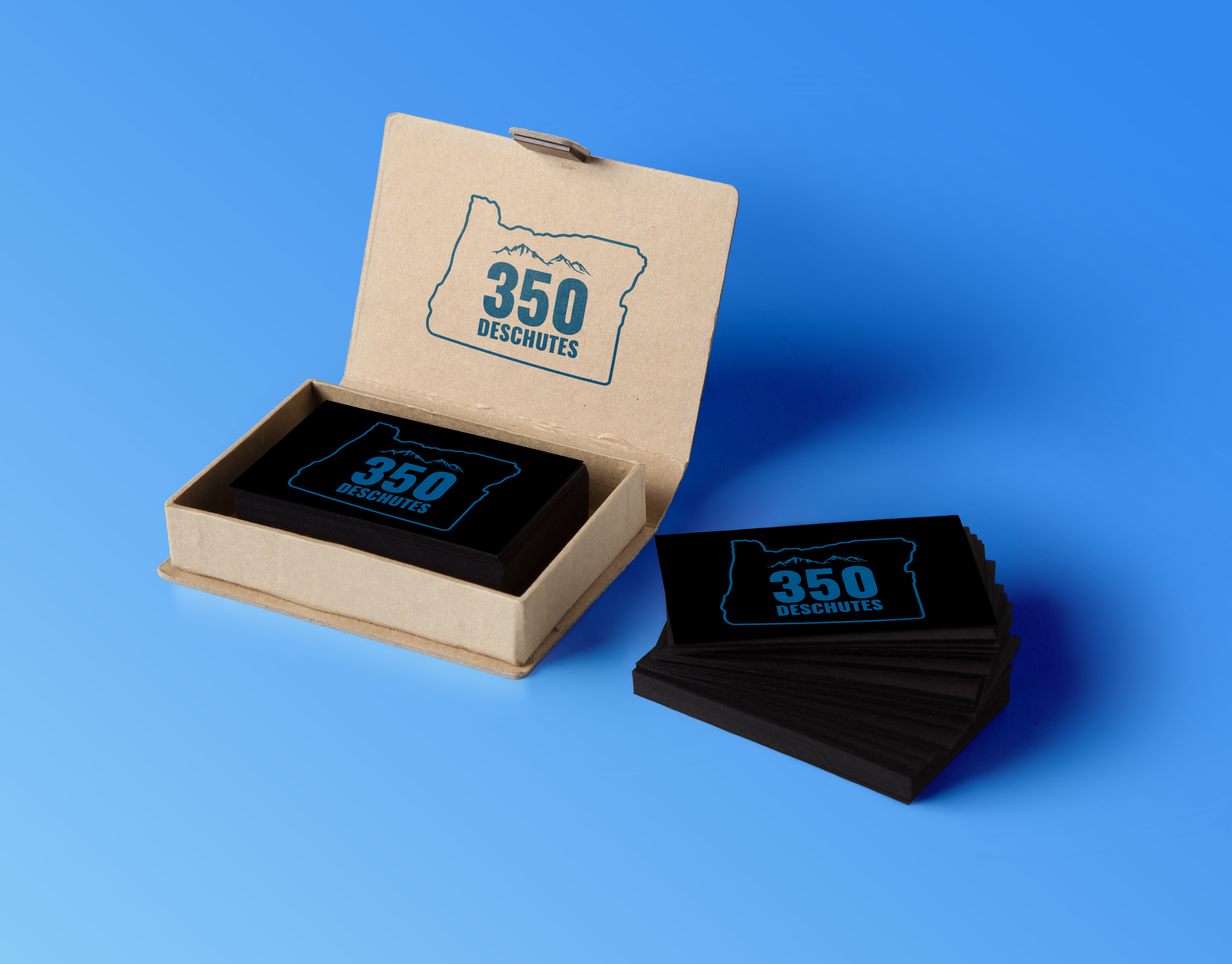
350 Deschutes
2018
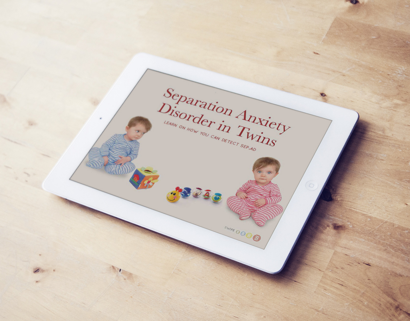
Separation Anxiety Disorder - Sep.AD
↑
Back to Top