An information-driven publication built to clarify safety protocols and strengthen campus awareness.
PROJECT: Editorial Design
CLIENT: Public Safety Department, University of North Georgia
CLIENT: Public Safety Department, University of North Georgia
YEAR: 2023-present
Roles: Art Direction and Visual Designer
Deliverables: Annual report and digital template(s)
Deliverables: Annual report and digital template(s)
CHALLENGE: Campus safety information is often communicated through dense policy documents and scattered digital updates, making it difficult for students to understand what actions to take in high-stress situations. The challenge was to translate complex safety protocols into a clear, accessible editorial system that students would actually read and retain.
Audience: Undergraduate and graduate students who need quick, trustworthy safety information. Secondary audiences include campus staff, administrators, and orientation leaders who rely on communication materials to reinforce safety protocols.
Constraints: The publication needed to align with UNG’s strict brand standards, including color usage, typography, and accessibility guidelines, which limited certain design choices. Because campus security is a sensitive topic, the visual tone had to balance clarity with care—avoiding alarmist imagery while still communicating urgency. Information also had to remain accurate and legally compliant, requiring careful interpretation of university policies and coordination with official sources.
APPROACH/PROCESS: Using the complete set of safety protocols provided by UNG’s Clery Compliance Officer, I reorganized the content into a clear, student-friendly editorial structure. My focus was on simplifying the flow, establishing visual hierarchy, and designing a layout that feels calm, readable, and aligned with UNG branding.
Research & Concept/Design Development: All factual information and guidelines were supplied by the Clery Compliance Officer. From this material, I identified key points students need most, where confusion typically occurs, and what information requires emphasis. My insight work centered on how to communicate these details visually and accessibly. I explored ways to present sensitive safety information without overwhelming readers—testing layouts, typographic scales, icons, and call-out systems. The concept focused on clarity, reassurance, and quick navigation. Within UNG’s brand requirements, I built a flexible grid, clear type hierarchy, and structured system for long-form text and quick-reference elements. Iterations refined spacing, emphasis, and icon use to ensure accuracy, visual clarity, and consistency across formats.
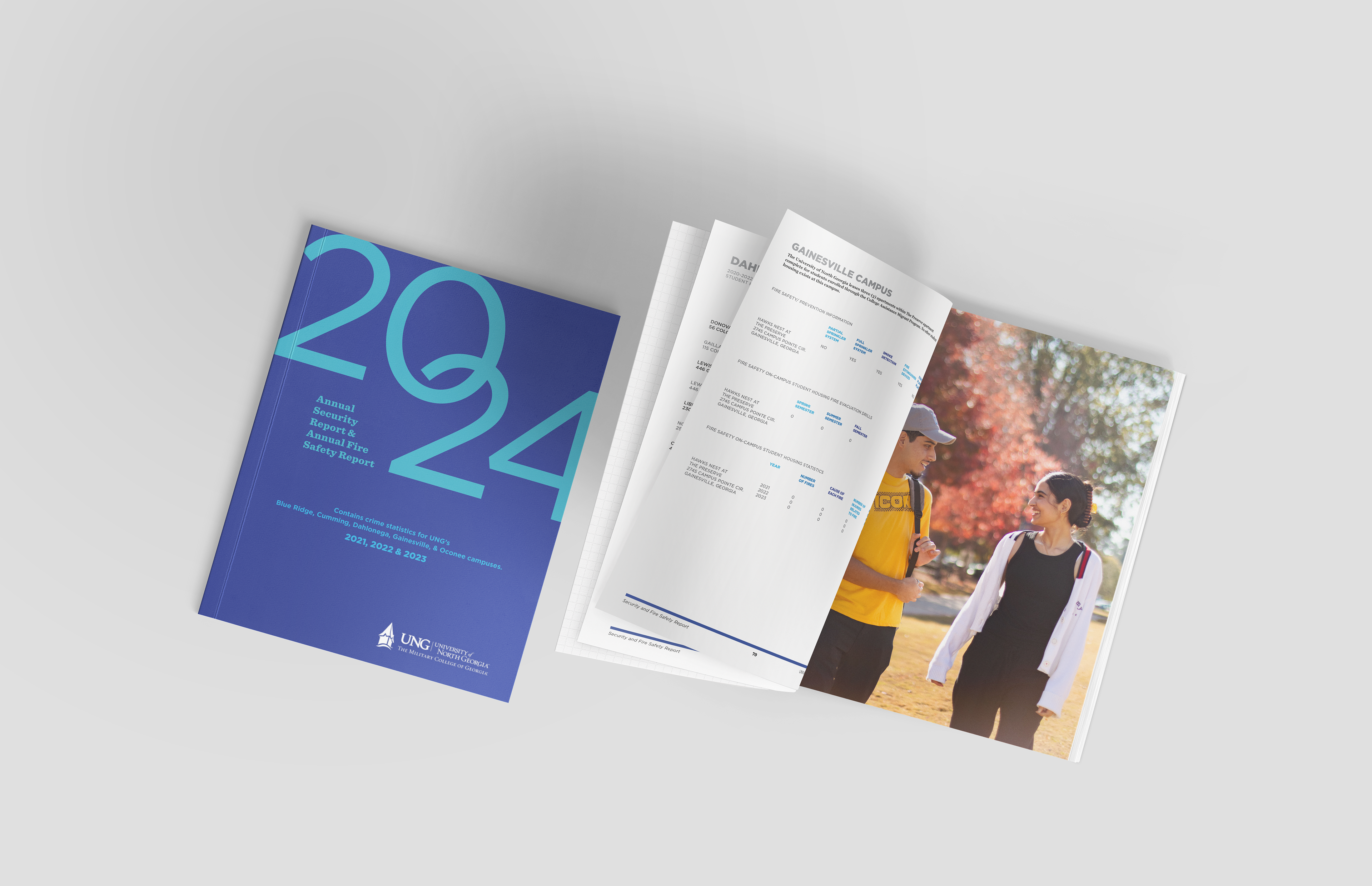
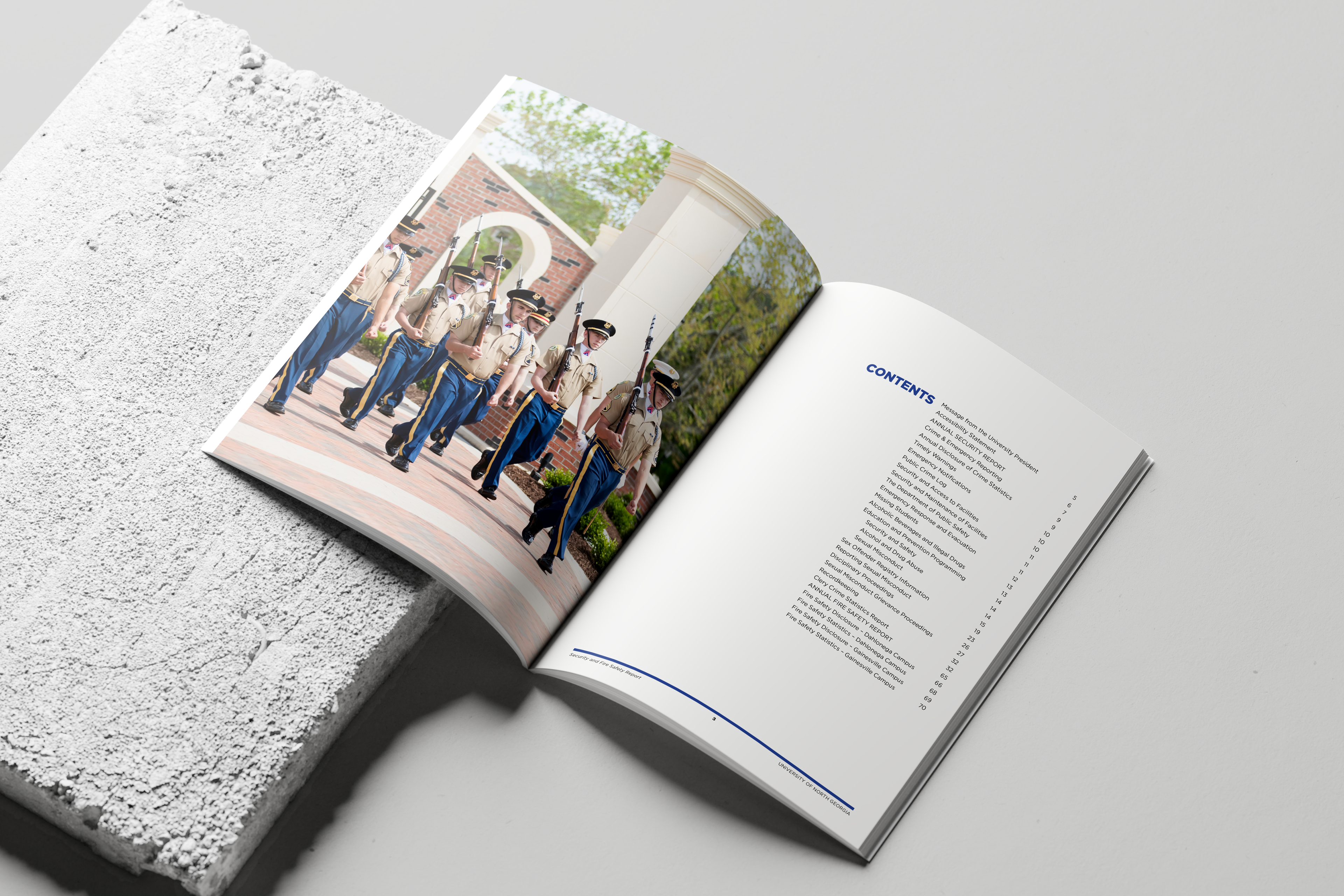
SOLUTIONS: The final publication turns complex safety protocols into a clear, approachable student guide. It features organized sections, visual cues, a calm tone, and a modular layout ready for future updates. The guide is also accessible to all institutions within the University System of Georgia (USG), allowing broader distribution and adaptation.
RESULTS: The Clery Compliance Officer and staff noted improved clarity and readability. The publication now serves as a model for making dense, compliance-required information accessible to students across the USG system.
“This report is a key resource that outlines our policies and procedures related to Title IX and Sexual Misconduct, ensuring transparency and support for those in need. Tiffany's design expertise has allowed UNG to develop an accessible and engaging document.” — Brooke Smith, Clery Officer of UNG.
Takeaway: Working on the AFS-UNG 2024 project reminded me how intentional design can shape understanding. The process pushed me to refine my choices, clarify my message, and create work that feels purposeful and human-centered. It strengthened my belief that effective design isn’t just visually strong — it communicates with impact.